What is a Visualization? | Choosing the Right Visualization | How to Change Chart Types
What is a Visualization?
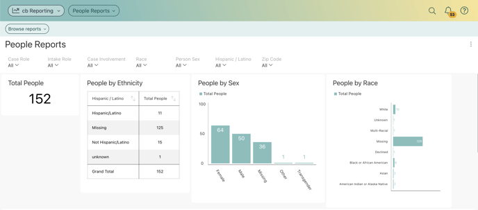
For users to get the most insight possible out of Casebook data, cb Reporting provides several options to customize the way information is visualized. These are called "visualizations". Any dashboard is composed of one or more visualizations.
The dashboard shown below contains a variety of visualizations, all of which analyze different aspects of Demographic Information.
Choosing the Right Visualization
In choosing the best chart type, you need to look at your data and answer the questions that will help you find out what story you are trying to tell with your visualization.
Are you trying to compare data, show data distribution or present it as a part of a whole breakdown? Are you looking at relationships between data? Or do you want to show KPIs and gauges, which are really easy to read and tell a quick story? Is it important to plot your data on a map?
How to Change Chart Types
When creating a new dashboard in the Report Builder:
The Report Builder defaults to a pivot table, but you can adjust the chart type by selecting the icon below and choosing the chart type that works best for your data. 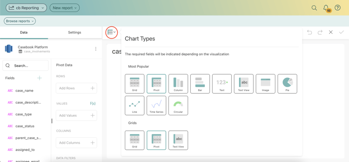
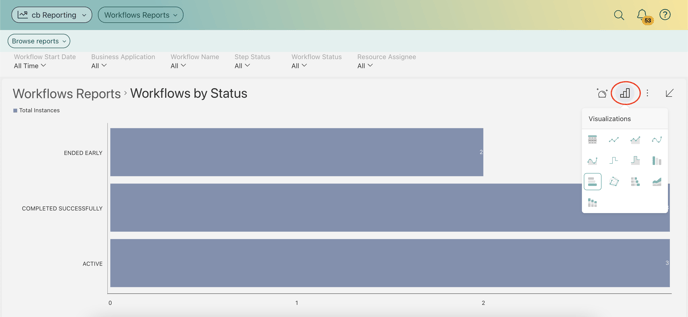
When using a previously built report:
You can change the chart type on a dashboard by selecting the graph icon, then choosing the chart type that works best for your data.