Category Charts
A category chart is a visualization option used to associate categories with quantitative information.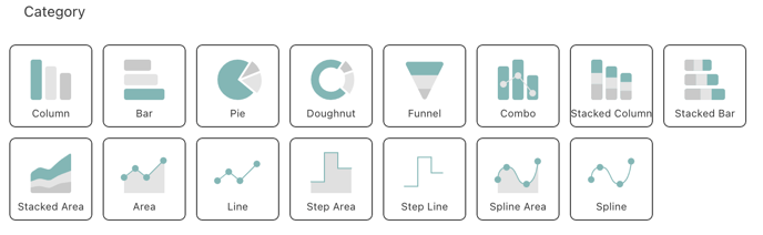
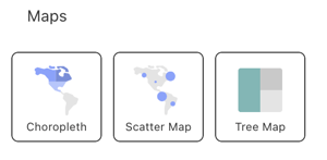
Map Charts
(Interested in this feature? Contact your CSM to learn more.)
A map chart is a visualization option used to depict statistical data in divided geographical areas or regions. Each area on the map is filled with uniform color in relation to a data variable.
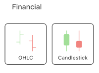
Financial Charts
A financial chart is a visualization option for displaying financial movements during a full day.
Gauge Charts
A gauge chart is a visualization option for displaying a single value, or a list of values, comparing them with range thresholds. A gauge chart also allows for conditional formatting of the different ranges.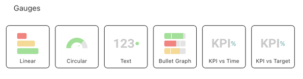
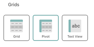
Grid Chart
A grid chart is a visualization option for displaying data, which presents the information in a matrix.
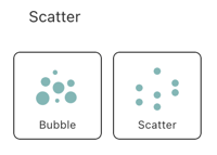
Scatter and Bubble Charts
A scatter chart is a visualization option to represent the relationship between two quantitative measures by plotting data points along the X (horizontal) and Y (vertical) axes. They are particularly useful for demonstrating patterns in large datasets.
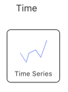
Time Charts
A time chart is a visualization option for displaying data points indexed in time order. It is commonly used to detect trends at a glance, allowing easy observation of development over time.
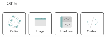
Other Charts