.png?width=1286&height=255&name=logo-raspberry%20(1).png)
Introduction
When you drag and drop a form component, like a text field, you are given many further customizations to determine how the form component will look.
These customizations fall under several categories including display, data, validation, etc.
The different form components: text field, text area, number, password, check box, radio button, etc., have slight differences in terms of which customizations they offer, but all their customization options are generally pretty similar. Customizations that are specific to certain form components are noted below.
Display Customizations
- Label: This is the name of the text box.
- Examples: First Name, Facility Name, Birthdate, etc
- Examples: First Name, Facility Name, Birthdate, etc
- Label Position: This indicates if the label should go above or below the text box. Select from the dropdown menu. Also, as you select different options, the Preview will automatically update.
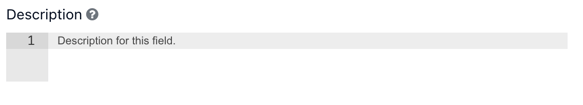
- Description: If the field needs additional information or instructions, it can be added here. Click on the text and start typing. The description will be displayed underneath the field.
- Row: This indicates how many rows of text a text box should have.
- Tooltip: This is a bit of text that users can see by hovering over a small circle next to the text box. It can give the user hints or further instructions.
- Prefix: This indicates that a user should type in a prefix. It makes the text box look short.
- Suffix: This indicates that a user should type in a suffix. It makes the text box short.
- Widget: This allows you to decide if you really want users to input text or if you want them to pick from a calendar dropdown instead.
Data Customizations
Default Value: This is a block of text that automatically shows up in the form component unless users change it.
Input Format: This can allow users to type in HTML code instead of regular text.
Text Case: This can force users to type in all capital or all lowercase letters.
Decimal Places: When working with numbers (as opposed to text), this tells users how many decimal places they can enter. With two decimal places, they can enter “3.14.” With eight decimal places, they can enter “3.14159265.”
Validation Customizations
Required: If you check the “required” checkbox, it forces users to enter information into that text box and gives an error message if they skip it.
Unique: If you check the “unique” checkbox, it forces users to enter information into that text box that is different from what they already typed in. If they type in two pieces of text that are the same, they get an error message.
Maximum and Minimum Length: If you choose a maximum and/or minimum length, it requires users to enter a certain number of characters into the text box. If they type in text that is too long or too short, they get an error message.
Maximum and Minimum Word Length: If you choose a maximum and/or minimum length, it requires users to enter a certain number of words into the text box. If they type in too many or too few words, they get an error message.
Maximum and Minimum Value: When working with numbers (as opposed to text), if you choose a maximum and/or minimum value, it requires users to enter a number of a certain value. If they type in too high a number or too low a number, they get an error message.
Error Label: An error label allows you to type in an error message. This error label will be added onto the error message that the system gives automatically.
Custom Error Message: A custom error message allows you to type in a custom error message. This error message overrides whatever error message the system would have otherwise given.
API Customizations
Note: Don’t worry about most of the API customizations. There is only one API customization you need to know about:
Custom Properties Form Redaction: This allows you to redact information on a form. If you need to share a document with other parties and the document contains fields with sensitive data that other parties should not have access to, these fields can be configured so that text like “(undisclosed)” is overlaid on top and the sensitive data remains private.
See the steps below on how to use this feature:
Redacting Content
- In a form, create a field with content you want to remain anonymous.
- In this case, we’ll use the example, “Victim’s Name.”
Note: See Creating and Editing Forms for more information on creating forms.
- In this case, we’ll use the example, “Victim’s Name.”
- Hover over “Victim’s Name” and click
 edit.
edit.
- In the window that opens, click “API.”
- Click “+ Add Another.”
- Under “Key,” write “redact-with.”
- Under “Value,” write “(undisclosed).”

- Click “Save.”
- Now you can see what the victim’s name is in the form, but when someone else downloads the form as a PDF, the victim’s name will be taken out. Therefore, the victim’s name will remain anonymous for anyone who shouldn’t see that private information.
Conditional and Logic Customizations
Simple: This allows you to create boolean operations. This means that you can hide or show a component based on the value of another component. For example, if a user checks off a box in a checkbox component, then a particular text field can appear. If a user does not check off that box, then the text field will be hidden.
Logic: This allows you to trigger an action based on the value of another component. For example, if a user checks off a box in a checkbox component, then the document might be saved.
Date/Time Customizations
Display in Timezone: This allows you to decide if the timezone displayed is the time zone that the user is in or if it’s always UTC.
Allow Manual Input: This allows you to decide whether or not the user should be able to enter the time and date manually.
Format: This shows how the date and time should be displayed. For example, the format “yyyy-MM-dd hh:mm a” would give a date and time like “2019-10-31 12:00 pm” for October 31st, 2019 at noon.
Maximum and Minimum Date: If you choose a maximum and/or minimum date, it requires users to enter a date within a certain window of time. If they type in a date that is outside that window of time, they get an error message.
Button Customizations
Action: This tells a user what will happen once they click the button, like if the form will be submitted or if it will be saved or if it will be deleted.
Theme: This shows which color the button will be.
Size: This shows how big or small the button will be.
Block Button: If you check the “block button” checkbox, the button becomes a block.
Currency Customizations
Currency: This shows which currency to use, like US dollars or British pounds.
Select Box Customizations and Checkbox Customizations
Input Type: This allows you to decide whether you want to use a radio button or a checkbox.
Maximum and Minimum Checked Number: If you choose a maximum and/or minimum checked number, it requires users to check off a certain number of boxes. If they check off too many or too few boxes, they get an error message, or they might not be able to submit the form.
Examples: Radio buttons allow exclusive selection among different form elements. For instance, if you want to provide a choice between "Married" or "Single" for Marital Status on your PDF form, radio buttons enable users to pick one, automatically deselecting the other. To set up a new Radio interface, simply drag each "radio" checkbox onto the PDF form using the Checkbox component.
- Create your multiple checkboxes and set their labels (for example we can use Married and Single).
- Edit each component and change InputType to Radio. Once you do, you will then see two text boxes show up called Radio Key and Radio Value.
- For Radio Key of each box set the name of the section (for this example we will use marriagestatus). Must be exactly the same in all and contain no spaces.
- For Radio Value set the value you would like to see (for this example we will use married for the Married checkbox and single for the Single checkbox).
Important Note About Form Components
Please note that Casebook does not currently support multi-select options on any form component. If you're designing or editing a form, ensure that each field allows for only a single selection to avoid data or functionality issues.
Signature Customizations
Width: This shows how much space users have to sign their names.
Height: This shows how tall users can make their signature.
Background Color: This shows the background color that the user’s signature will be on top of.
Pen Color: This shows the font color that the user’s signature will show up as.
Examples:
Here is a customized text field:
Here is a customized number box:
Here is a customized series of select boxes:
